Empowering Support
Improving Donations & Resource Access for Homeless Youth in SF

THE CHALLENGE
While the Homeless Youth Alliance (HYA) has successfully provided vital resources and support to homeless youth in San Francisco, the challenge was to redesign its outdated website to serve its diverse user base better and communicate its impact more effectively.
THE SOLUTION
Many new users expect a seamless experience with updated information and effortless ways to provide support. Without meeting these expectations, the site risks losing potential donors and reducing long-term engagement.
My Role
UX/UI Designer
Timeline
May 2024 - Jun 2024
Team
Lucia Bonsack
Tyne Hedrick
Melissa Majewski
Tools
Figma
Photoshop

DISCOVER
Survey & User Interviews
We conducted a survey with 14 participants and user interviews with 6 individuals. Based on this research, we identified key takeaways to guide the redesign.

Key Takeaways
Transparency is Crucial
The majority of respondents prefer to know exactly how their donations will be used. Clearly communicating impact through success stories, financial breakdowns, and real-time updates will improve trust and encourage donations.
Diverse Support Options Matter
A significant of respondents are interested in alternative ways to support beyond financial contributions. Providing options such as volunteering, advocacy efforts, in-kind donations, and social sharing will enhance engagement and broaden the support base.
Competitor Analysis
I started off by monitoring direct and indirect competitors that provide similar concepts to my product: mission statement clean navigation, easy access. By doing so, I was able to gather ideas and solutions for improving the user experience by implementing different features.
EMPATHIZE
User Persona &
User Pain Points
Understanding users’ needs and pain points

User Painpoints
Experiencing outdated data and friction of donation processes hinder the ability for Emily to build trust in Homeless Youth Alliance and effectively contribute.
IDEATE
Mapping out the experience
Helping users achieve their goal easily
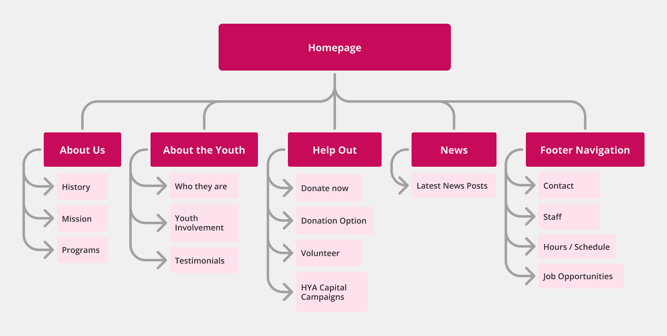
Information Architecture
Based on the previous virtual card sorting, I created an Information Architecture that meets user expectations.
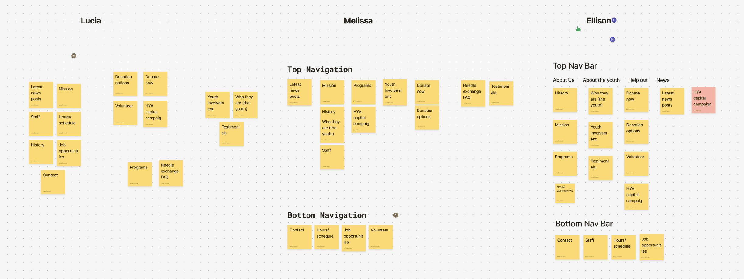
Virtual Card Sorting
Unmoderated virtual card sorting was conducted to create an Information Architecture that meets user expectations
WEBSITE
Focused on simplified navigation, making it easier for users to access resources and donation options without confusion.

MOBILE
Emphasized a clear content hierarchy, ensuring that users can easily understand HYA’s impact and initiatives, while maintaining accessibility across all devices.
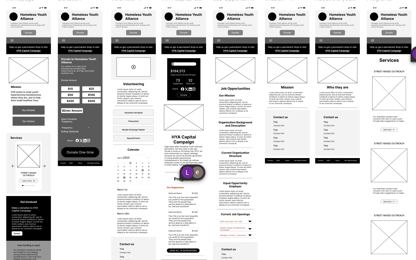
PROTOTYPE
Low-Fi Prototype
Our low-fidelity prototype was designed based on key pain points and major user research findings. The goal was to create a more intuitive experience that clearly communicates the organization's mission and programs, making it easier for users to understand how HYA supports homeless youth.
Empowering Support
Improving Donations & Resource Access for Homeless Youth in SF
THE CHALLENGE
While the Homeless Youth Alliance (HYA) has successfully provided vital resources and support to homeless youth in San Francisco, the challenge was to redesign its outdated website to serve its diverse user base better and communicate its impact more effectively.
THE SOLUTION
Many new users expect a seamless experience with updated information and effortless ways to provide support. Without meeting these expectations, the site risks losing potential donors and reducing long-term engagement.
My Role
UX/UI Designer
Timeline
May 2024 - Jun 2024
Team
Lucia Bonsack
Tyne Hedrick
Melissa Majewski
Tools
Figma
Photoshop
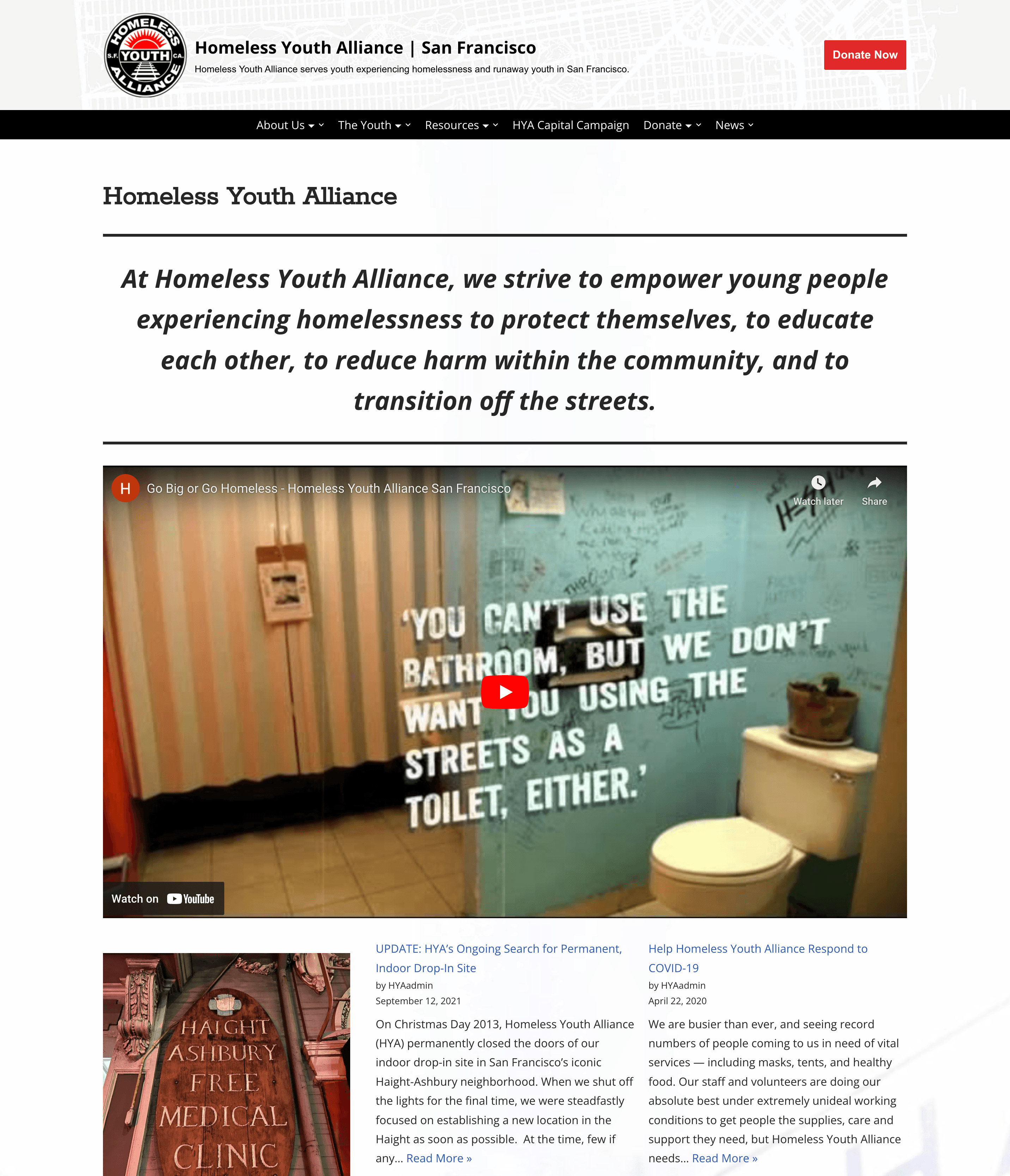
The video is featured prominently, but there’s no context or explanation provided.
The news section looks unorganized, with inconsistent formatting and unclear focus.
The page lacks a prominent Donate button, relying on linked text that is easy to overlook.
Information is dense and lacks visual structure, making it hard to read.
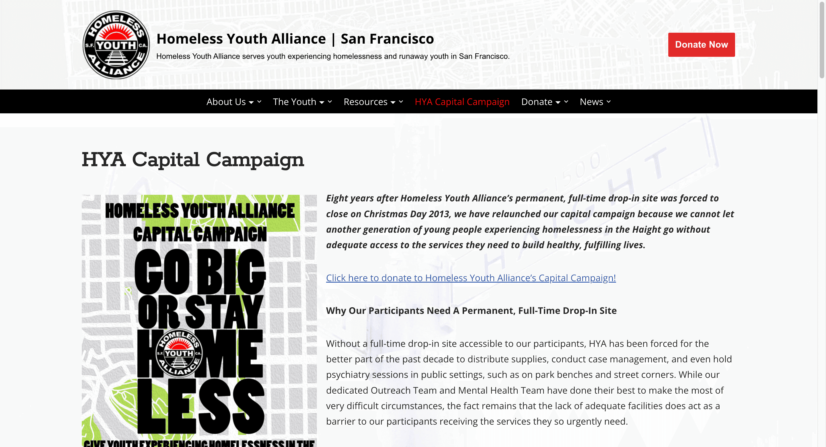
The page does not display the current progress toward the fundraising goal, which reduces transparency and urgency.
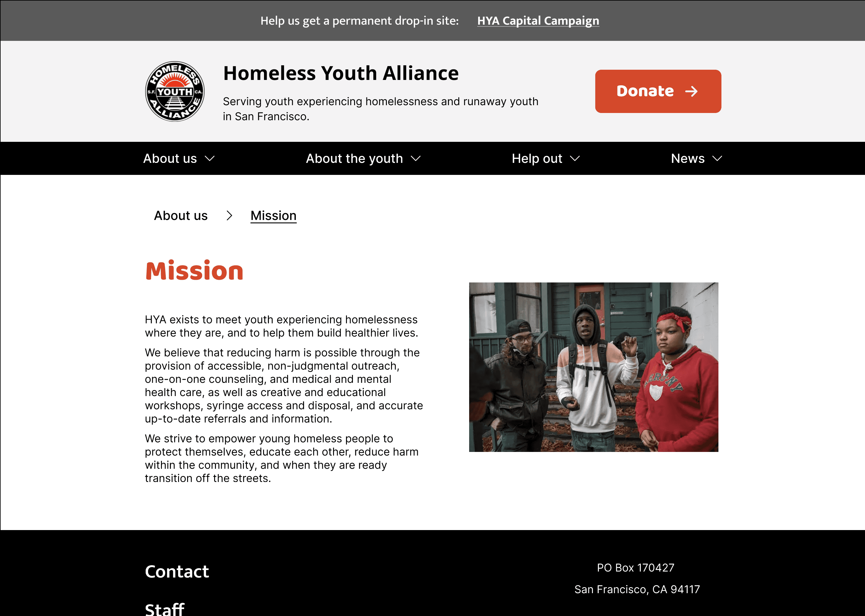
The hero section wastes valuable space and fails to communicate the purpose of the site.
The button is too small and does not stand out as the primary call-to-action.
The navigation links are small, making them difficult to click, especially on mobile devices.
Campaign page
The purpose and goals of the campaign are not immediately clear.
Homepage
It’s difficult for users to quickly understand what the organization does or who it helps.
WEBSITE AUDIT
The Current Web Experience
DISCOVER
Survey & User Interviews
We conducted a survey with 14 participants and user interviews with 6 individuals. Based on this research, we identified key takeaways to guide the redesign.
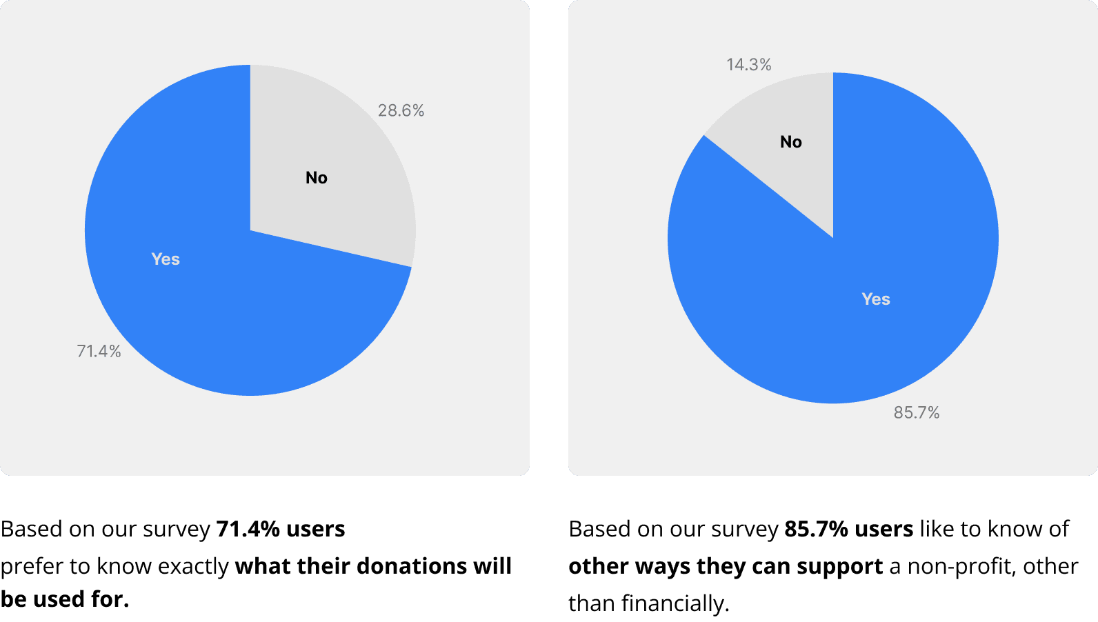
28.6%
71.4%
Yes
No
Based on our survey 71.4% users
prefer to know exactly what their donations will be used for.
85.7%
14.3%
Yes
No
Based on our survey 85.7% users like to know of other ways they can support a non-profit, other than financially.
USER INTERVIEW
“
It seems really outdated, like, early 2000’s.
It’s not a website I would trust.
”
“
Resources, and ways I can help are
the first things that I look for.
”
“
I can tell there’s a drive behind
[the organization] in an honest way.
”
Key Takeaways
Transparency is Crucial
The majority of respondents prefer to know exactly how their donations will be used. Clearly communicating impact through success stories, financial breakdowns, and real-time updates will improve trust and encourage donations.
Diverse Support Options Matter
A significant of respondents are interested in alternative ways to support beyond financial contributions. Providing options such as volunteering, advocacy efforts, in-kind donations, and social sharing will enhance engagement and broaden the support base.
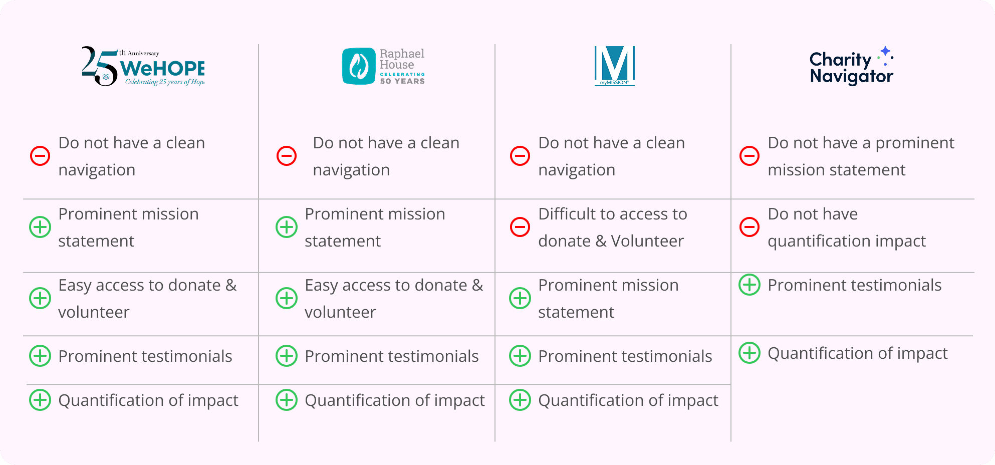
Competitor Analysis
I started off by monitoring direct and indirect competitors that provide similar concepts to my product: mission statement clean navigation, easy access. By doing so, I was able to gather ideas and solutions for improving the user experience by implementing different features.
2025 Ellison Hwang. All Rights Reserved.
2025 Ellison Hwang. All Rights Reserved.

Do not have a clean navigation
Prominent mission statement
Easy access to donate & volunteer
Prominent testimonials
Quantification of impact

Do not have a clean navigation
Prominent mission statement
Easy access to donate & volunteer
Prominent testimonials
Quantification of impact
Do not have a clean navigation
Difficult to access to donate & Volunteer
Prominent mission statement
Prominent testimonials
Quantification of impact
Do not have a prominent mission statement
Do not have quantification impact
Prominent testimonials
Quantification of impact
EMPATHIZE
User Persona & User Painpoints
Understanding users’ needs and pain points
Emily johnson
Marketing manager
ABOUT
Age: 54
Education: Bachelor
Occupation: Marketing Manager
Location: Seattle,WA
CHRACHTERISTIC
Proactive
Thoughful
Informed
Supportive
BACKGROUND
She supports education, environmental conservation, and animal welfare through careful selection of transparent and effective nonprofits. Emily enjoys hiking, reading, and the culinary scene alongside her partner and two rescue dogs, applying her professional skills to her philanthropic efforts.
PAINPOINTS
Complicated donation processes that require too much personal information or time
Lack of clarity about how donations are used
Left wondering about the actual impact of contributions.

User Painpoints
Experiencing outdated data and friction of donation processes hinder the ability for Emily to build trust in Homeless Youth Alliance and effectively contribute.
IDEATE
Mapping out the experience
Helping users achieve their goal easily
Information Architecture
Based on the previous virtual card sorting, I created an Information Architecture that meets user expectations.
Virtual Card Sorting
Unmoderated virtual card sorting was conducted to create an Information Architecture that meets user expectations
PROTOTYPE
Low-Fi Prototype
Our low-fidelity prototype was designed based on key pain points and major user research findings. The goal was to create a more intuitive experience that clearly communicates the organization's mission and programs, making it easier for users to understand how HYA supports homeless youth.
WEBSITE
Focused on simplified navigation, making it easier for users to access resources and donation options without confusion.
MOBILE
Emphasized a clear content hierarchy, ensuring that users can easily understand HYA’s impact and initiatives, while maintaining accessibility across all devices.
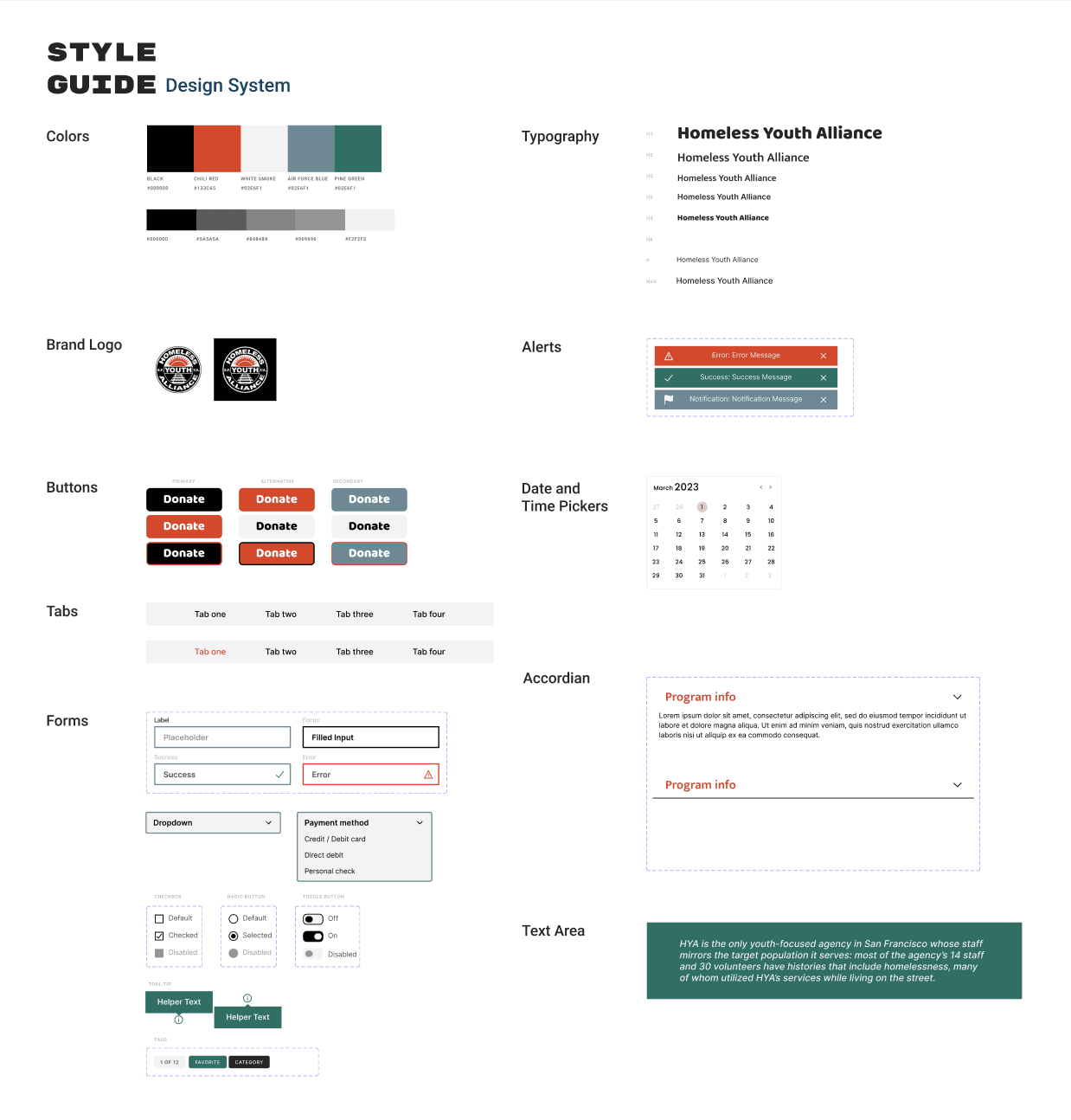
User interface Design
Visual Style Guide
Our UI style guide, featuring a passionate, urban aesthetic and colors derived from our logo, was chosen to ensure the design not only meets user needs but also resonates with the organization’s identity.
USABILITY TESTING & IMPLEMENTING FEEDBACK
ITERATIONS
I conducted a usability test with five users in my target demographic using the prototype to see how user friendly the website is.
BEFORE

AFTER

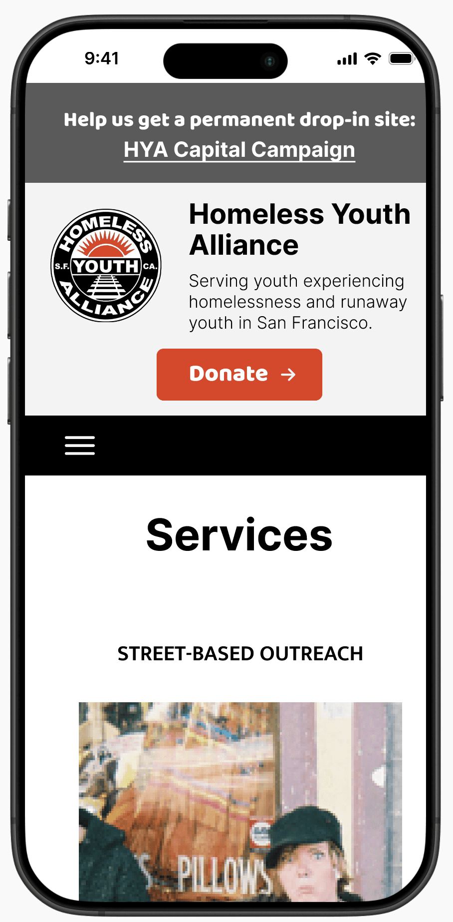
PAIN POINTS
Not easy to overview services part
Added “horizontal scroll” to easy to overview what the organize serve to the youth
BEFORE
AFTER

PAIN POINTS
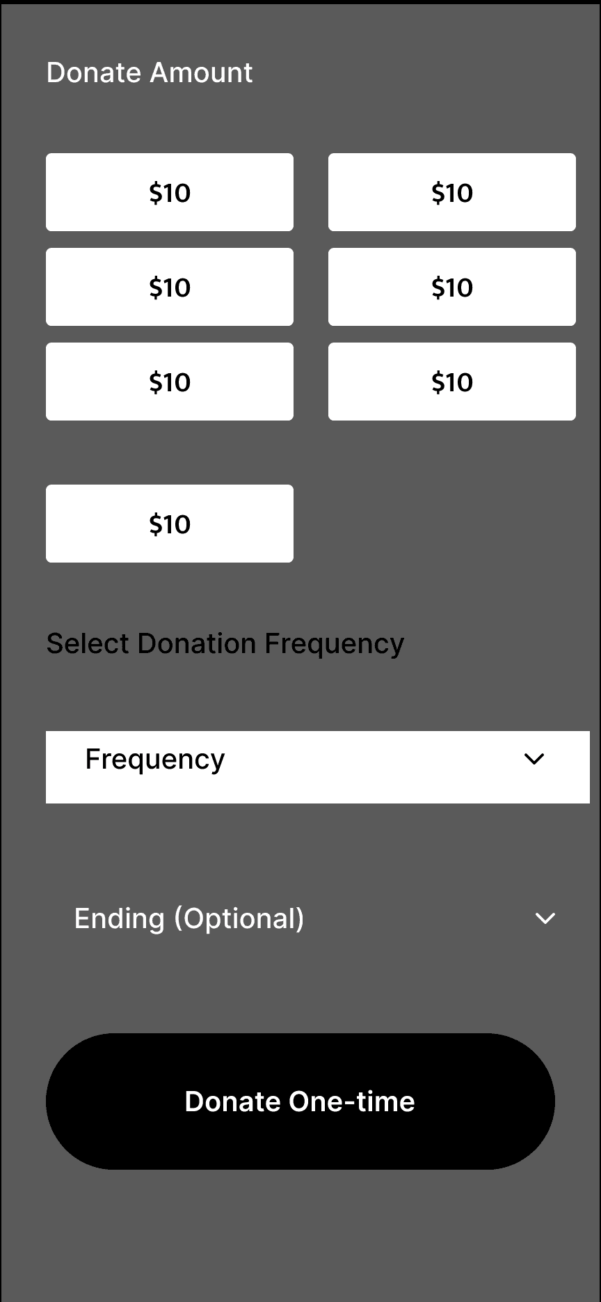
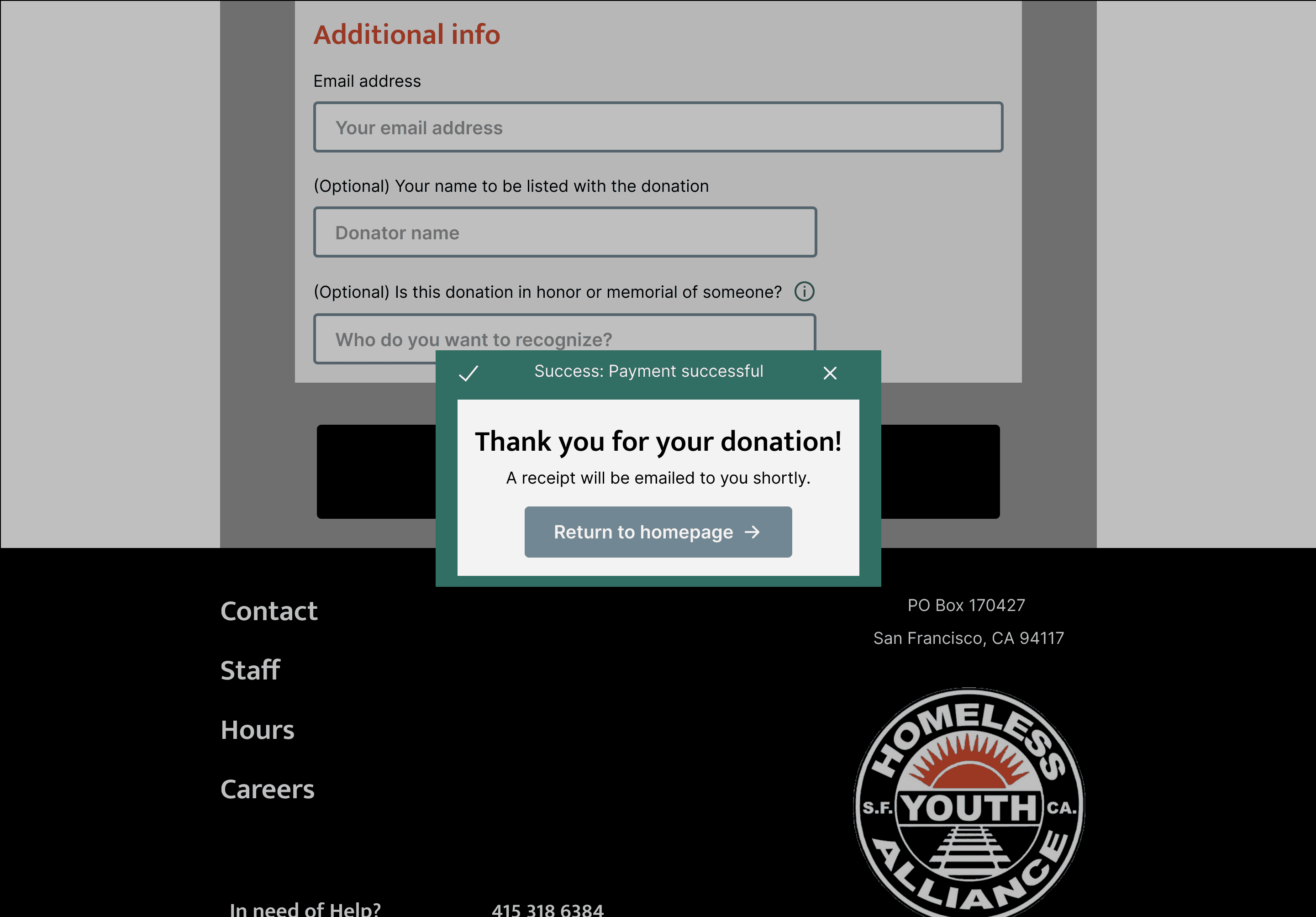
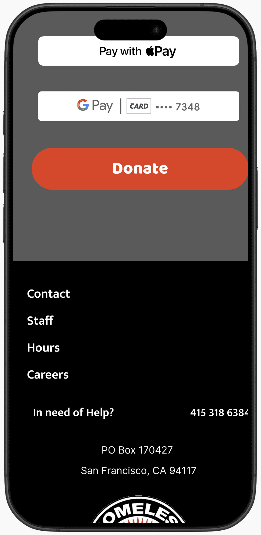
Make a donation:
Limited payment option
Gave variety payment options for easy access donation
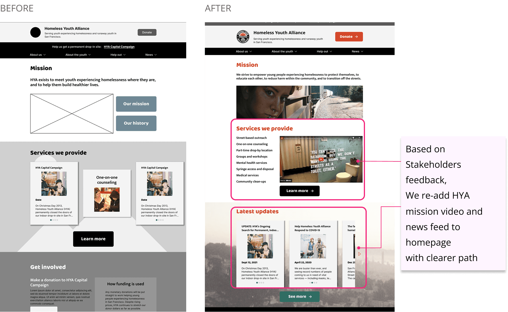
Stakeholders Feedback
Re-add video and news feed to homepage
Bifurcate site into clearer paths for donors and participants (could prob be done easily via top nav - so like About us, About the Youth, Resources, Help out, and then move news into About us)
BEFORE

AFTER

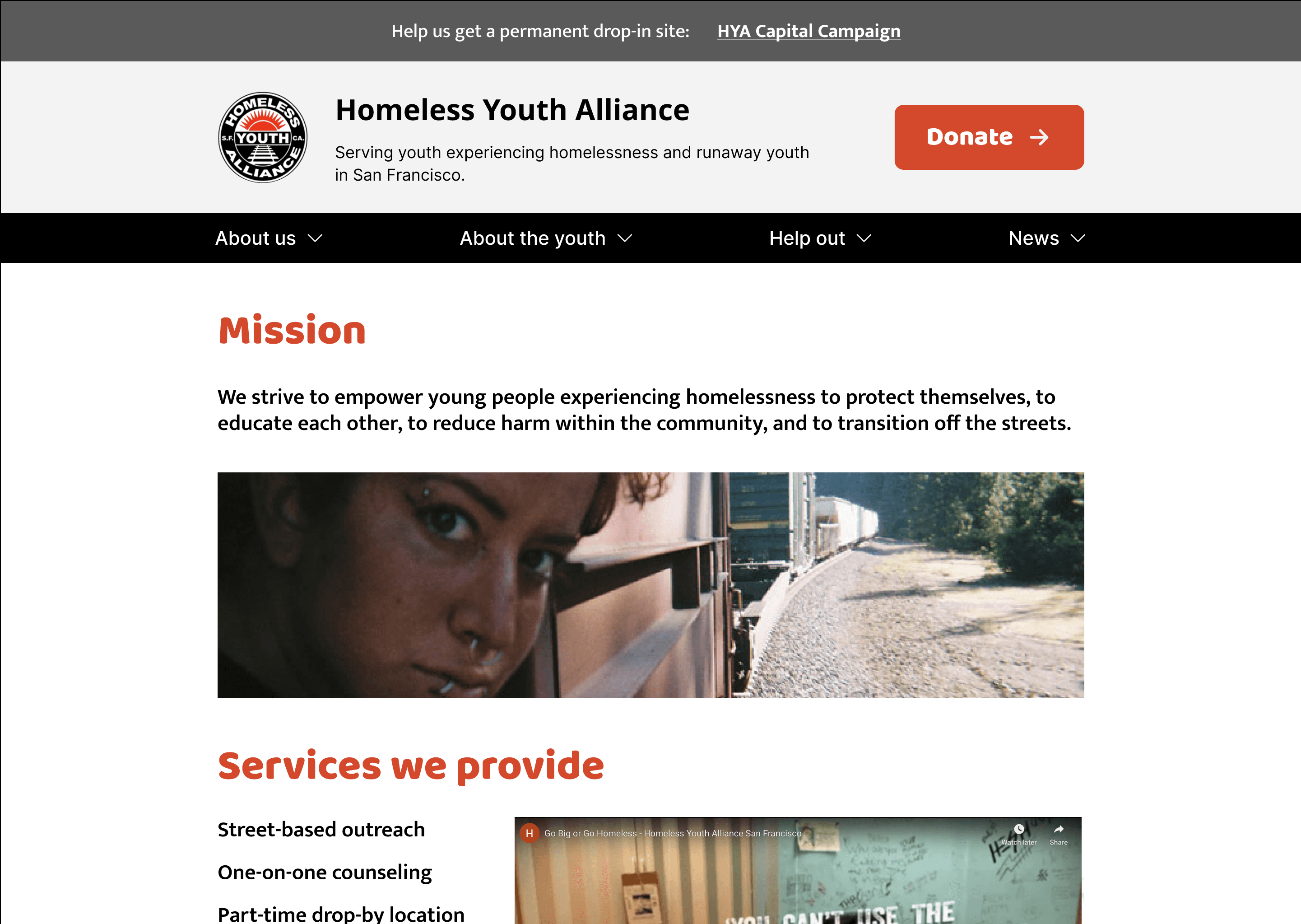
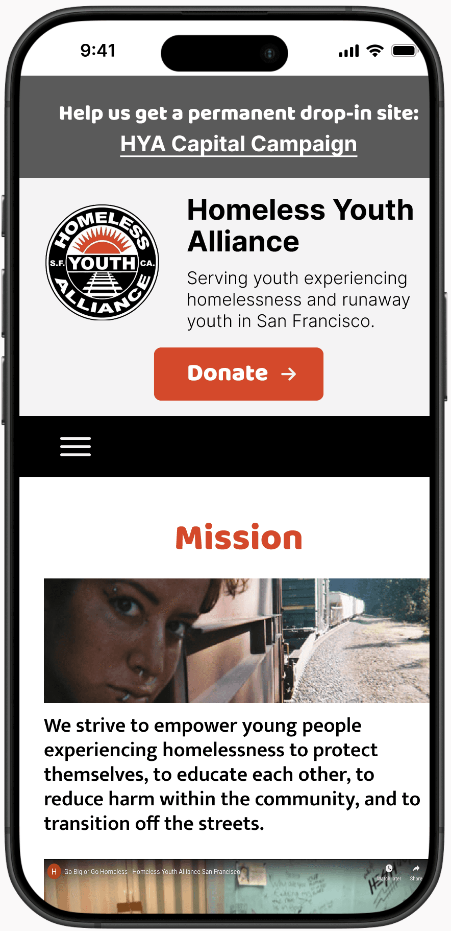
Based on Stakeholders feedback,
We re-add HYA mission video and
news feed to homepage
with clearer path
PROTOTYPE
High-Fi Prototype


REFLECTION
What I learned & Next Step
Learnings
Adaptability is Key
Throughout the design process, we had to remain flexible and responsive to stakeholder feedback and user insights. Adjusting our approach based on real-time findings was crucial to refining the final solution.
Different Users Interpret Designs Differently
User testing revealed that people interact with the same design in completely different ways. Understanding these varying perspectives helped us refine navigation, content hierarchy, and overall usability.
Increasing Engagement Without “Selling”
Since HYA is a nonprofit, it was essential to create an engaging experience without making users feel like they were being pressured to donate. We focused on storytelling, transparency, and impact-driven messaging to build trust and encourage participation naturally.
Next Step
Navigation Bifurcation for Different Audiences
Further refine the navigation structure to differentiate the user journey for those seeking resources versus donors and volunteers.
Conduct More Stakeholder Interviews
Deeper engagement with HYA staff and real users will provide more valuable insights to fine-tune content and functionality.
Enhancing Visual Content
Incorporate more high-resolution images to make the site feel more dynamic and immersive, particularly on the news and blog pages to improve engagement and readability.
2025 Ellison Hwang. All Rights Reserved.
E
2025 Ellison Hwang. All Rights Reserved.
Empowering Support
Improving Donations & Resource Access for Homeless Youth in SF
My Role
UX/UI Designer
Timeline
May 2024 - Jun 2024
Team
Lucia Bonsack
Tyne Hedrick
Melissa Majewski
Tools
Figma
Photoshop
THE CHALLENGE
While the Homeless Youth Alliance (HYA) has successfully provided vital resources and support to homeless youth in San Francisco, the challenge was to redesign its outdated website to serve its diverse user base better and communicate its impact more effectively.
THE SOLUTION
Many new users expect a seamless experience with updated information and effortless ways to provide support. Without meeting these expectations, the site risks losing potential donors and reducing long-term engagement.
DISCOVER
Survey & User Interviews
We conducted a survey with 14 participants and user interviews with 6 individuals. Based on this research, we identified key takeaways to guide the redesign.
Key Takeaways
Transparency is Crucial
The majority of respondents prefer to know exactly how their donations will be used. Clearly communicating impact through success stories, financial breakdowns, and real-time updates will improve trust and encourage donations.
Diverse Support Options Matter
A significant of respondents are interested in alternative ways to support beyond financial contributions. Providing options such as volunteering, advocacy efforts, in-kind donations, and social sharing will enhance engagement and broaden the support base.

Competitor Analysis
I started off by monitoring direct and indirect competitors that provide similar concepts to my product: mission statement clean navigation, easy access. By doing so, I was able to gather ideas and solutions for improving the user experience by implementing different features.
EMPATHIZE
User Persona &
User Pain Points
Understanding users’ needs and pain points
User Painpoints
Experiencing outdated data and friction of donation processes hinder the ability for Emily to build trust in Homeless Youth Alliance and effectively contribute.
IDEATE
Mapping out the experience
Helping users achieve their goal easily
Information Architecture
Based on the previous virtual card sorting, I created an Information Architecture that meets user expectations.
Virtual Card Sorting
Unmoderated virtual card sorting was conducted to create an Information Architecture that meets user expectations
PROTOTYPE
Low-Fi Prototype
Our low-fidelity prototype was designed based on key pain points and major user research findings. The goal was to create a more intuitive experience that clearly communicates the organization's mission and programs, making it easier for users to understand how HYA supports homeless youth.
WEBSITE
Focused on simplified navigation, making it easier for users to access resources and donation options without confusion.
MOBILE
Emphasized a clear content hierarchy, ensuring that users can easily understand HYA’s impact and initiatives, while maintaining accessibility across all devices.
USABILITY TESTING & IMPLEMENTING FEEDBACK
ITERATIONS
I conducted a usability test with five users in my target demographic using the prototype to see how user friendly the website is.


Stakeholders Feedback
Re-add video and news feed to homepage
Bifurcate site into clearer paths for donors and participants (could prob be done easily via top nav - so like About us, About the Youth, Resources, Help out, and then move news into About us)
PROTOTYPE
High-Fi Prototype

REFLECTION
What I learned & Next Step
Learnings
Adaptability is Key
Throughout the design process, we had to remain flexible and responsive to stakeholder feedback and user insights. Adjusting our approach based on real-time findings was crucial to refining the final solution.
Different Users Interpret Designs Differently
User testing revealed that people interact with the same design in completely different ways. Understanding these varying perspectives helped us refine navigation, content hierarchy, and overall usability.
Increasing Engagement Without “Selling”
Since HYA is a nonprofit, it was essential to create an engaging experience without making users feel like they were being pressured to donate. We focused on storytelling, transparency, and impact-driven messaging to build trust and encourage participation naturally.
Next Step
Navigation Bifurcation for Different Audiences
Further refine the navigation structure to differentiate the user journey for those seeking resources versus donors and volunteers.
Conduct More Stakeholder Interviews
Deeper engagement with HYA staff and real users will provide more valuable insights to fine-tune content and functionality.
Enhancing Visual Content
Incorporate more high-resolution images to make the site feel more dynamic and immersive, particularly on the news and blog pages to improve engagement and readability.
USABILITY TESTING & IMPLEMENTING FEEDBACK
ITERATIONS
I conducted a usability test with five users in my target demographic using the prototype to see how user friendly the website is.
PROTOTYPE
High-Fi Prototype
REFLECTION
What I learned & Next Step
Learnings
Adaptability is Key
Throughout the design process, we had to remain flexible and responsive to stakeholder feedback and user insights. Adjusting our approach based on real-time findings was crucial to refining the final solution.
Different Users Interpret Designs Differently
User testing revealed that people interact with the same design in completely different ways. Understanding these varying perspectives helped us refine navigation, content hierarchy, and overall usability.
Increasing Engagement Without “Selling”
Since HYA is a nonprofit, it was essential to create an engaging experience without making users feel like they were being pressured to donate. We focused on storytelling, transparency, and impact-driven messaging to build trust and encourage participation naturally.
Next Step
Navigation Bifurcation for Different Audiences
Further refine the navigation structure to differentiate the user journey for those seeking resources versus donors and volunteers.
Conduct More Stakeholder Interviews
Deeper engagement with HYA staff and real users will provide more valuable insights to fine-tune content and functionality.
Enhancing Visual Content
Incorporate more high-resolution images to make the site feel more dynamic and immersive, particularly on the news and blog pages to improve engagement and readability.